Color blindness is an inaccurate term. Most color-blind people can see color, they just don't see the same colors as everyone else.
There have been a number of articles written about how to improve graphs, charts, and other visual aids on computers to better serve color-blind people. That is a worthwhile endeavor, and the people writing them mean well, but I suspect very few of them are color-blind because the advice is often poor and sometimes wrong. The most common variety of color blindness is called red-green color blindness, or deuteranopia, and it affects about 6% of human males. As someone who has moderate deuteranopia, I'd like to explain what living with it is really like.
The answer may surprise you.
I see red and green just fine. Maybe not as fine as you do, but just fine. I get by. I can drive a car and I stop when the light is red and go when the light is green. (Blue and yellow, by the way, I see the same as you. For a tiny fraction of people that is not the case, but that's not the condition I'm writing about.)
If I can see red and green, what then is red-green color blindness?
To answer that, we need to look at the genetics and design of the human vision system. I will only be writing about moderate deuteranopia, because that's what I have and I know what it is: I live with it. Maybe I can help you understand how that impairment—and it is an impairment, however mild—affects the way I see things, especially when people make charts for display on a computer.
There's a lot to go through, but here is a summary. The brain interprets signals from the eye to determine color, but the eye doesn't see colors. There is no red receptor, no green receptor in the eye. The color-sensitive receptors in the eye, called cones, don't work like that. Instead there are several different types of cones with broad but overlapping color response curves, and what the eye delivers to the brain is the difference between the signals from nearby cones with possibly different color response. Colors are what the brain makes from those signals.
There are also monochromatic receptors in the eye, called rods, and lots of them, but we're ignoring them here. They are most important in low light. In bright light it's the color-sensitive cones that dominate.
For most mammals, there are two color response curves for cones in the eye. They are called warm and cool, or yellow and blue. Dogs, for instance, see color, but from a smaller palette than we do. The color responses are determined, in effect, by pigments in front of the light receptors, filters if you will. We have this system in our eyes, but we also have another, and that second one is the central player in this discussion.
We are mammals, primates, and we are members of the branch of primates called Old World monkeys. At some point our ancestors in Africa moved to the trees and started eating the fruit there. The old warm/cool color system is not great at spotting orange or red fruit in a green tree. Evolution solved this problem by duplicating a pigment and mutating it to make a third one. This created three pigments in the monkey eye, and that allowed a new color dimension to arise, creating what we now think of as the red/green color axis. That dimension makes fruit easier to find in the jungle, granting a selective advantage to monkeys, like us, who possess it.
It's not necessary to have this second, red/green color system to survive. Monkeys could find fruit before the new system evolved. So the red/green system favored monkeys who had it, but it wasn't necessary, and evolutionary pressure hasn't yet perfected the system. It's also relatively new, so it's still evolving. As a result, not all humans have equivalent color vision.
The mechanism is a bit sloppy. The mutation is a "stutter" mutation, meaning that the pigment was created by duplicating the original warm pigment's DNA and then repeating some of its codon sequences. The quality of the new pigment—how much the pigment separates spectrally from the old warm pigment—is determined by how well the stutter mutation is preserved. No stutter, you get just the warm/cool dimension, a condition known as dichromacy that affects a small fraction of people, almost exclusively male (and all dogs). Full stutter, you get the normal human vision with yellow/blue and red/green dimensions. Partial stutter, and you get me, moderately red-green color-blind. Degrees of red-green color blindness arise according to how much stutter is in the chromosome.
Those pigments are encoded only on the X chromosome. That means that most males, being XY, get only one copy of the pigment genes, while most females, being XX, get two. If an XY male inherits a bad copy of the X he will be color-blind. An XX female, though, will be much less likely to get two bad copies. But some will get a good one and a bad one, one from the mother and one from the father, giving them four pigments. Such females are called tetrachromatic and have a richer color system than most of us, even than normal trichromats like you.
The key point about the X-residence of the pigment, though, is that men are much likelier than women to be red-green color-blind.
Here is a figure from an article by Denis Baylor in an essay collection called Colour Art & Science, edited by Trevor Lamb and Janine Bourriau, an excellent resource.
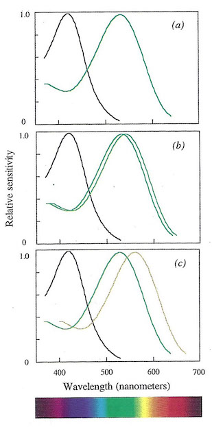
The top diagram shows the pigment spectra of a dichromat, what most mammals have. The bottom one shows the normal trichromat human pigment spectra. Note that two of the pigments are the same as in a dichromat, but there is a third, shifted slightly to the red. That is the Old World monkey mutation, making it possible to discriminate red. The diagram in the middle shows the spectra for someone with red-green color blindness. You can see that there are still three pigments, but the difference between the middle and longer-wave (redder) pigment is smaller.
A deuteranope like me can still discriminate red and green, just not as well. Perhaps what I see is a bit like what you see when evening approaches and the color seems to drain from the landscape as the rods begin to take over. Or another analogy might be what happens when you turn the stereo's volume down: You can still hear all the instruments, but they don't stand out as well.
It's worth emphasizing that there is no "red" or "green" or "blue" or "yellow" receptor in the eye. The optical pigments have very broad spectra. It's the difference in the response between two receptors that the vision system turns into color.
In short, I still see red and green, just not as well as you do. But there's another important part of the human visual system that is relevant here, and it has a huge influence on how red-green color blindness affects the clarity of diagrams on slides and such.
It has to do with edge detection. The signals from receptors in the eye are used not only to detect color, but also to detect edges. In fact since color is detected largely by differences of spectral response from nearby receptors, the edges are important because that's where the strongest difference lies. The color of a region, especially a small one, is largely determined at the edges.
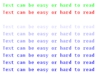
Of course, all animals need some form of visual processing that identifies objects, and edge detection is part of that processing in mammals. But the edge detection circuitry is not uniformly deployed. In particular, there is very little high-contrast detection capability for cool colors. You can see this yourself in the following diagram, provided your monitor is set up properly. The small pure blue text on the pure black background is harder to read than even the slightly less saturated blue text, and much harder than the green or red. Make sure the image is no more than about 5cm across to see the effect properly, as the scale of the contrast signal matters:

In this image, the top line is pure computer green, the next is pure computer red, and the bottom is pure computer blue. In between is a sequence leading to ever purer blues towards the bottom. For me, and I believe for everyone, the bottom line is very hard to read.
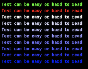
Here is the same text field as above but with a white background:
Notice that the blue text is now easy to read. That's because it's against white, which includes lots of light and all colors, so it's easy for the eye to build the difference signals and recover the edges. Essentially, it detects a change of color from the white to the blue. Across the boundary the level of blue changes, but so do the levels red and green. When the background is black, however, the eye depends on the blue alone—black has no color, no light to contribute a signal, no red, no green—and that is a challenge for the human eye.
Now here's some fun: double the size of the black-backgrounded image and the blue text becomes disproportionately more readable:
Because the text is bigger, more receptors are involved and there is less dependence on edge detection, making it easier to read the text. As I said above, the scale of the contrast changes matters. If you use your browser to blow up the image further you'll see it becomes even easier to read the blue text.
And that provides a hint about how red-green color blindness looks to people who have it.
For red-green color-blind people, the major effect comes from the fact that edge detection is weaker in the red/green dimension, sort of like blue edge detection is for everyone. Because the pigments are closer together than in a person with regular vision, if the color difference in the red-green dimension is the only signal that an edge is there, it becomes hard to see the edge and therefore hard to see the color.
In other words, the problem you have reading the blue text in the upper diagram is analogous to how much trouble a color-blind person has seeing detail in an image with only a mix of red and green. And the issue isn't between computer red versus computer green, which are quite easy to tell apart as they have very different spectra, but between more natural colors on the red/green dimension, colors that align with the naturally evolved pigments in the cones.
In short, color detection when looking at small things, deciding what color an item is when it's so small that only the color difference signal at the edges can make the determination, is worse for color-blind people. Even though the colors are easy to distinguish for large objects, it's hard when they get small.
In this next diagram I can easily tell that in the top row the left block is greenish and the right block is reddish, but in the bottom row that is a much harder distinction for me to make, and it gets even harder if I look from father away, further shrinking the apparent size of the small boxes. From across the room it's all but impossible, even though the colors of the upper boxes remain easy to identify.

Remember when I said I could see red and green just fine? Well, I can see the colors just fine (more or less). But that is true only when the object is large enough that the color analysis isn't being done only by edge detection. Fields of color are easy, but lines and dots are very hard.
Here's another example. Some devices come with a tiny LED that indicates charging status by changing color: red for low battery, amber for medium, and green for a full charge. I have a lot of trouble discriminating the amber and green lights, but can solve this by holding the light very close to my eye so it occupies a larger part of the visual field. When the light looks bigger, I can tell what color it is.
Another consequence of all this is that I see very little color in the stars. That makes me sad.
Remember this is about color, just color. It's easy to distinguish two items if their colors are close but their intensities, for example, are different. A bright red next to a dull green is easy to spot, even if the same red dulled down to the level of the green would not be. Those squares above are at roughly equal saturations and intensities. If not, it would be easier to tell which is red and which is green.
To return to the reason for writing this article, red/green color blindness affects legibility. The way the human vision system works, and the way it sometimes doesn't work so well, implies there are things to consider when designing an information display that you want to be clearly understood.
First, choose colors that can be easily distinguished. If possible, keep them far apart on the spectrum. If not, differentiate them some other way, such as by intensity or saturation.
Second, use other cues if possible. Color is complex, so if you can add another component to a line on a graph, such as a dashed versus dotted pattern, or even good labeling, that helps a lot.
Third, edge detection is key to comprehension but can be tricky. Avoid difficult situations such as pure blue text on a black background. Avoid tiny text.
Fourth, size matters. Don't use the thinnest possible line. A fatter one might work just as well for the diagram but be much easier to see and to identify by color.
And to introduce one last topic, some people, like me, have old eyes, and old eyes have much more trouble with scattered light and what that does to contrast. Although dark mode is very popular these days, bright text on a black background scatters in a way that makes it hard to read. The letters have halos around them that can be confusing. Black text on a white background works well because the scatter is uniform and doesn't make halos. It's fortunate that paper is white and ink is black, because that works well for all ages.
The most important lesson is to not assume you know how something appears to a color-blind person, or to anyone else for that matter. If possible, ask someone you know who has eyes different from yours to assess your design and make sure it's legible. The world is full of people with vision problems of all kinds. If only the people who used amber LEDs to indicate charge had realized that.

