This is my closing talk (video) from the GopherConAU conference in Sydney, given November 10, 2023, the 14th anniversary of Go being launched as an open source project. The text is interspersed with the slides used in the presentation.
What We Got Right, What We Got Wrong
INTRODUCTION
Hello.
Let me start by thanking Katie and Chewy for the giving me the honor of presenting the closing talk for the conference. And apologize for reading this from my script but I want to get the words right.
 |
| November 10, 2009 |
Today is November 10, 2023, the 14th anniversary of the launch of Go as an open source project.
That day, at 3pm California time if memory serves, Ken Thompson, Robert Griesemer, Russ Cox, Ian Taylor, Adam Langley, Jini Kim and I watched expectantly as the site went live and the world learned what we had been up to.
Fourteen years later, there is much to look back on. Today I'd like to take the opportunity to talk about some of the larger lessons learned since that day. Even the most successful projects have things that, upon reflection, could have been done better. And of course, things that in hindsight seem to have been key to their success.
Up front I must make clear that I am speaking only for myself, not for the Go team and not for Google. Go was and still is a huge effort by a dedicated team and a huge community, so if you agree with anything I say, thank them. If you disagree, blame me but please keep it to yourself 😃.
Given the title of this talk, many people might expect I'm going to be analyzing good and bad things in the language. Of course I'll do some of that, but much more besides, for several reasons.
First, what's good and bad in a programming language is largely a matter of opinion rather than fact, despite the certainty with which many people argue about even the most trivial features of Go or any other language.
Also, there has already been plenty of discussion about things such as where the newlines go, how nil works, using upper case for export, garbage collection, error handling, and so on. There are certainly things to say there, but little that hasn't already been said.
But the real reason I'm going to talk about more than the language is that that's not what the whole project was about. Our original goal was not to create a new programming language, it was to create a better way to write software. We had issues with the languages we were using—everyone does, whatever the language—but the fundamental problems we had were not central to the features of those languages, but rather to the process that had been created for using them to build software at Google.
 |
| The first gopher on a t-shirt |
The creation of a new language provided a new path to explore other ideas, but it was only an enabler, not the real point. If it didn't take 45 minutes to build the binary I was working on at the time, Go would not have happened, but those 45 minutes were not because the compiler was slow, because it wasn't, or because the language it was written in was bad, because it wasn't. The slowness arose from other factors.
And those factors were what we wanted to address: The complexities of building modern server software: controlling dependencies, programming with large teams with changing personnel, ease of maintainability, efficient testing, effective use of multicore CPUs and networking, and so on.
In short, Go is not just a programming language. Of course it is a programming language, that's its definition, but its purpose was to help provide a better way to develop high-quality software, at least compared to our environment 14 plus years ago.
And that's still what it's about today. Go is a project to make building production software easier and more productive.
A few weeks back, when starting to prepare this talk, I had a title but little else. To get me going, I asked people on Mastodon for input. A fair few responded, and I noticed a trend in the replies: people thought the things we got wrong were all in the language, but those we got right were in the larger story, the stuff around the language like gofmt and deployment and testing. I find that encouraging, actually. What we were trying to do seems to have had an effect.
But it's worth admitting that we didn't make clear early on what the true goals were. Perhaps we felt they were self-evident. To address that shortcoming, in 2013 I gave a talk at the SPLASH conference entitled, Go at Google: Language Design in the Service of Software Engineering.
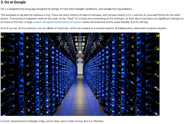 |
| Go at Google |
That talk and associated blog post are perhaps the best explanation of why Go happened.
Today's talk is something of a follow-on to the SPLASH talk, looking back on the lessons learned once we got past building the language and could apply ourselves to the bigger picture more broadly.
And so... some lessons.
First, of course, we have:
The Gopher
It may seem an odd place to start, but the Go gopher is one of the earliest factors in Go's success. We knew long before the launch that we wanted a mascot to adorn the schwag - every project needs schwag - and Renee French offered to create one for us. We got that part absolutely right.
Here is a picture of the very first instance of the gopher plushie.
 |
| The gopher |
And here is a picture of the gopher with the less successful first prototype.
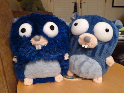 |
| The gopher with his less evolved ancestor |
The Gopher is a mascot who serves as a badge of honor, even an identifier for Go programmers everywhere. At this moment you are in a conference, one of many, called GopherCon. Having a recognizable, funny creature ready to share the message from day one was vital to Go's growth. Its goofy yet intelligent demeanor—he can build anything!
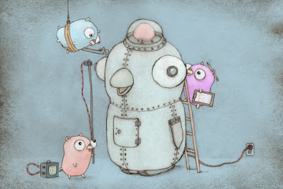 |
| Gophers building a robot (drawing by Renee French) |
—sets the tone for the community's engagement with the project, one of technical excellence allied with real fun. Most important, the gopher serves as a banner for the community, a flag to rally around, especially in the early days when Go was still an upstart in the programming world.
Here's a picture of gophers attending a conference in Paris some years back. Look how excited they are!
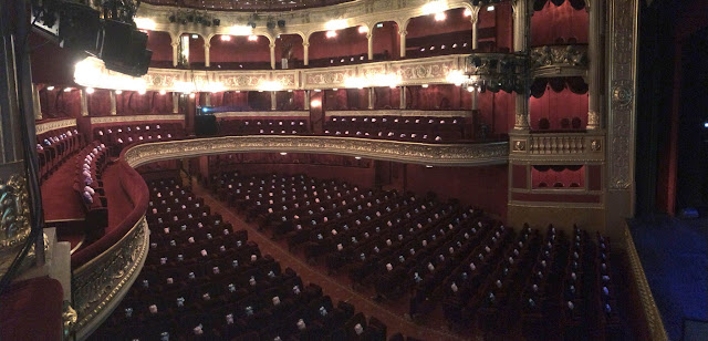 |
| Gopher audience in Paris (photo by Brad Fitzpatrick) |
All that said, releasing the Gopher design under a Creative Commons Attribution license was perhaps not the best choice. On the one hand, it encouraged people to remix him in fun ways, which in turn helped foster community spirit.
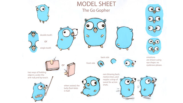 |
| Gopher model sheet |
Renee created a "model sheet" to help artists work with him while keeping him true to his spirit.
Some artists had fun playing with these characteristics and making their own versions of him; Renee and my favorites are the ones by the Japanese designer @tottie:
 |
| @tottie's gophers |
and game programmer @tenntenn:
 |
| @tenntenn's gopher |
But the "attribution" part of the license often resulted in frustrating arguments, or in false credit given to Renee for creations that were not hers and not in the spirit of the original. And, to be honest, the attribution was often honored only reluctantly or not at all. For instance, I doubt @tenntenn was compensated or even acknowledged for this use of his gopher illustration.
 |
| gophervans.com: Boo! |
So if we were doing it over, we'd think hard about the best way to make sure the mascot stays true to his ideals. It's a hard problem, maintaining a mascot, and the solution remains elusive.
But on to more technical things.
Done Right
Here is a list of things that I think we got objectively right, especially in retrospect. Not every language project has done these things, but each was crucial to the ultimate success of Go. I'll try to be brief, because they will all be familiar topics.
1. Specification. We started with a formal specification. Not only does that lock down behavior when writing a compiler, it enables multiple implementations to coexist and agree on that behavior. A compiler alone is not a specification. What do you test the compiler against?
 |
The specification, as seen on the web
|
Oh and by the way, the first draft of the specification was written here, on the 18th floor of a building on Darling Harbour in Sydney. We are celebrating Go's birthday in Go's home town.
2. Multiple implementations. There are multiple compilers, all implementing the same spec. Having a spec makes this much easier to achieve.
Ian Taylor surprised us when he sent mail one day informing us that, having read our draft spec, he'd written a compiler himself.
Subject: A gcc frontend for Go
From: Ian Lance Taylor
Date: Sat, Jun 7, 2008 at 7:06 PM
To: Robert Griesemer, Rob Pike, Ken Thompson
One of my office-mates pointed me at http://.../go_lang.html . It
seems like an interesting language, and I threw together a gcc
frontend for it. It's missing a lot of features, of course, but it
does compile the prime sieve code on the web page.
That was mind-blowing, but many more have followed, all made possible by the existence of a formal specification.
 |
| Lots of compilers |
Having multiple compilers helped us refine the language and polish the specification, as well as providing an alternative environment for others less enamored with our Plan-9-like way of doing business.
(More about that later.)
Today there are lots of compatible implementations, and that's great.
3. Portability. We made cross-compilation trivial, which allowed
programmers to work on whatever platform they liked, and ship to whatever platform was required. This may be easier with Go than with any other language. It's easy to think of the compiler as
native to the machine it runs on, but it has no reason to be.
Breaking that assumption is powerful and was news to many developers.
 |
| Portability |
4. Compatibility. We worked hard to get the language in shape for
version 1.0, and then locked it down with a compatibility guarantee. Given what a dramatic, documented effect that made on Go's uptake, I find it puzzling that most other projects have resisted doing this. Yes, there's a cost in maintaining strong compatibility, but it blocks feature- itis and, in a world in which almost nothing else is stable, it's delightful not to have to worry about new Go releases breaking your project.
 |
| The Go compatibility promise |
5. The library. Although it grew somewhat as an accident, as there was no other place to install Go code at the beginning, the existence of a solid, well-made library with most of what one needed to write 21st century server code was a major asset. It kept the community all working with the same toolkit until we had experience enough to understand what else should be made available. This worked out really well and helped prevent variant libraries from arising, helping unify the community.
 |
| The library |
6. Tools. We made sure the language was easy to parse, which enabled tool-building. At first we thought we'd need an IDE for Go, but easy tooling meant that, in time, the IDEs would come to Go. And along with gopls, they have, and they're awesome.
 |
| Tools |
We also provided a set of ancillary tools with the compiler, such as automated testing, coverage, and code vetting. And of course the go command, which integrated the whole build process and is all many projects need to build and maintain their Go code.
 |
| Fast builds |
Also, it didn't hurt that Go acquired a reputation for fast builds.
7. Gofmt. I pull gofmt out as a separate item from tools because it is the tool that made a mark not only on Go, but on the programming community at large. Before Robert wrote gofmt (which, by the way, he insisted on doing from the very beginning), automated formatters were not high quality and therefore mostly unused.
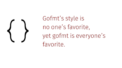 |
| Gofmt proverb |
Gofmt showed it could be done well, and today pretty much every language worth using has a standard formatter. The time saved by not arguing over spaces and newlines is worth all the time spent defining a standard format and writing this rather difficult piece of code to automate it.
Also, gofmt made countless other tools possible, such as simplifiers, analyzers and even the code coverage tool. Because gofmt's guts became a library anyone could use, you could parse a program, edit the AST, and just print byte-perfect output ready for humans to use as well as machines.
Thanks, Robert.
Enough with the congratulations, though. On to some more contentious topics.
Concurrency
Concurrency is contentious? Well, it certainly was in 2002, the year I joined Google. John Ousterhout had famously written that threads were bad, and many people agreed with him because they seemed to be very hard to use.
 |
| John Ousterhout doesn't like threads |
Google software avoided them almost always, pretty much banning them outright, and the engineers doing the banning cited Ousterhout. This bothered me. I'd been doing concurrency-like things, sometimes without even realizing it, since the 1970s and it seemed powerful to me. But upon reflection it became clear that Ousterhout was making two mistakes. First, he was generalizing beyond the domain he was interested in using threads for, and second, he was mostly complaining about using them through with clumsy low-level packages like pthread, and not about the fundamental idea.
It's a mistake common to engineers everywhere to confuse the solution and the problem like this. Sometimes the proposed solution is harder than the problem it addresses, and it can be hard to see there is an easier path. But I digress.
I knew from experience that there were nicer ways to use threads, or whatever we choose to call them, and even gave a pre-Go talk about them.
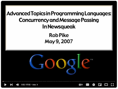 |
| Concurrency in Newsqueak |
But I wasn't alone in knowing this; a number of other languages, papers, and even books had been written about concurrent programming that showed it could be done well. It just hadn't caught on as a mainstream idea yet, and Go was born partly to address that. In that legendary 45-minute build I was trying to add a thread to a non-threaded binary, and it was frustratingly hard because we were using the wrong tools.
Looking back, I think it's fair to say that Go had a significant role in convincing the programming world that concurrency was a powerful tool, especially in the multicore networked world, and that it could be done better than with pthreads. Nowadays most mainstream languages have good support for concurrency.
 |
Google 3.0
|
Also, Go's version of concurrency was somewhat novel, at least in the line of languages that led to it, by making goroutines unflavored. No coroutines, no tasks, no threads, no names, just goroutines. We invented the word "goroutine" because no existing term fit. And to this day I wish the Unix spell command would learn it.
As an aside, because I am often asked about it, let me speak for a minute about async/await. It saddens me a bit that the async/await model with its associated style is the way many languages have chosen to support concurrency, but it is definitely a huge improvement over pthreads.
Compared to goroutines, channels, and select, async/await is easier and smaller for language implementers to build or to retrofit into existing platforms. But it pushes some of the complexity back on the programmer, often resulting in what Bob Nystrom has famously called "colored functions".
I think Go shows that CSP, which is a different but older model, fits perfectly into a procedural language without such complication. I've even seen it done several times as a library. But its implementation, done well, requires a significant runtime complexity, and I can understand why some folks would prefer not to build that into their system. It's important, though, whatever concurrency model you provide, to do it exactly once, because an environment providing multiple concurrency implementations can be problematic. Go of course solved that issue by putting it in the language, not a library.
There's probably a whole talk to give about these matters, but that's enough for now.
[End of aside]
Another value of concurrency was that it made Go seem like something new. As I said, some other languages had supported it before, but they were never mainstream, and Go's support for concurrency was a major attractor that helped grow early adoption, pulling in programmers that hadn't used concurrency before but were intrigued by its possibilities.
And that's where we made two significant mistakes.
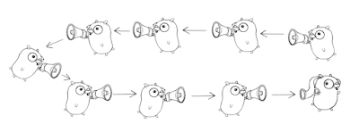 |
| Whispering gophers (Cooperating Sequential Processes) |
First, concurrency is fun and we were delighted to have it, but the use cases we had in mind
were mostly server stuff, meant to be done in key libraries such as net/http, and not everywhere in every program. And so when many programmers played with it, they struggled to work out how it really helped them. We should have explained up front that what concurrency support in the language really brought to the table was simpler server software. That problem space mattered to many but not to everyone who tried Go, and that lack of guidance is on us.
The related second point is that we took too long to clarify the difference between parallelism - supporting multiple computations in parallel on a multicore machine - and concurrency, which is a way to structure code to do that well.
Countless programmers tried to make their code faster by parallelizing it using goroutines, and were often baffled by the resulting slowdown. Concurrent code only goes faster when parallelized if the underlying problem is intrinsically parallel, like serving HTTP requests. We did a terrible job explaining that, and the result baffled many programmers and probably drove some away.
To address this, in 2012 I gave a talk at Waza, Heroku's developer conference, called, Concurrency is not Parallelism. It's a fun talk but it should have happened earlier.
Apologies for that. But the good point still stands: Go helped popularize concurrency as a way to structure server software.
Interfaces
It's clear that interfaces are, with concurrency, a distinguishing idea in Go. They are Go's answer to objected-oriented design, in the original, behavior-focused style, despite a continuing push by newcomers to make structs carry that load.
Making interfaces dynamic, with no need to announce ahead of time which types implement them, bothered some early critics, and still irritates a few, but it's important to the style of programming that Go fostered. Much of the standard library is built upon their foundation, and broader subjects such as testing and managing dependencies rely heavily on their generous, "all are welcome" nature.
I feel that interfaces are one of the best-designed things in Go.
Other than a few early conversations about whether data should be included in their definition, they arrived fully formed on literally the first day of discussions.
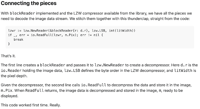 |
| A GIF decoder: an exercise in Go interfaces (Rob Pike and Nigel Tao 2011) |
And there is a story to tell there.
On that famous first day in Robert's and my office, we asked the question of what to do about polymorphism. Ken and I knew from C that qsort could serve as a difficult test case, so the three of us started to talk about how our embryonic language could implement a type-safe sort routine.
Robert and I came up with the same idea pretty much simultaneously: using methods on types to provide the operations that sort needed. That notion quickly grew into the idea that value types had behaviors, defined as methods, and that sets of methods could provide interfaces that functions could operate on. Go's interfaces arose pretty much right away.
 |
| sort.Interface |
That's something that is not often not acknowledged: Go's sort is implemented as a function that operates on an interface. This is not the style of object-oriented programming most people were familiar with, but it's a very powerful idea.
That idea was exciting for us, and the possibility that this could become a foundational
programming construct was intoxicating. When Russ joined, he soon pointed out how I/O would fit beautifully into this idea, and the library took place rapidly, based in large part on the three famous interfaces: empty, Writer, and Reader, holding an average of two thirds of a method each. Those tiny methods are idiomatic to Go, and ubiquitous.
The way interfaces work became not only a distinguishing feature of Go, they became the way we thought about libraries, and generality, and composition. It was heady stuff.
But we might have erred in stopping the conversation there.
You see, we went down this path at least in part because we had seen too often how generic programming encouraged a way of thinking that tended to focus on types before algorithms. Early abstraction instead of organic design. Containers instead of functions.
We defined generic containers in the language proper - maps, slices, arrays, channels - without giving programmers access to the genericity they contained. This was arguably a mistake. We believed, correctly I still think, that most simple programming tasks could be handled just fine by those types. But there are some that cannot, and the barrier between what the language provided and what the user could control definitely bothered some people.
In short, although I wouldn't change a thing about how interfaces worked, they colored our thinking in ways it took more than a decade to correct. Ian Taylor pushed us, from early on, to face this problem, but it was quite hard to do given the presence of interfaces as the bedrock of Go programming.
Critics often complained we should just do generics, because they are "easy", and perhaps they can be in some languages, but the existence of interfaces meant that any new form of polymorphism had to take them into account. Finding a way forward that worked well with the rest of the language required multiple attempts, several aborted implementations, and many hours, days, and weeks of discussion. Eventually we roped in some type theorists to help out, led by Phil Wadler. And even today, with a solid generic model in the language, there are still lingering problems to do with the presence of interfaces as method sets.
 |
| Generic sort specification |
The final answer, as you know, was to design a generalization of interfaces that could absorb more forms of polymorphism, transitioning from "sets of methods" to "sets of types". It's a subtle but profound move, one that most of the community seems to be fine with, although I suspect the grumbling will never stop.
Sometimes it takes many years to figure something out, or even to figure out that you can't quite figure it out. But you press on.
By the way, I wish we had a better term than "generics", which originated as the term for a different, data-structure-centric style of polymorphism. "Parametric polymorphism" is the proper term for what Go provides, and it's an accurate one, but it's an ugly mouthful. But "generics" is what we say, even though it's not quite right.
The Compiler
One of the things that bothered the programming language community was that the early Go compiler was written in C. The proper way, in their opinion, was to use LLVM or a similar toolkit, or to write the compiler in Go itself, a process called self-hosting. We didn't do either of these, for several reasons.
First, bootstrapping a new language requires that at least the first steps towards its compiler must be done in an existing language. For us, C was the obvious choice, as Ken had written a C compiler already, and its internals could serve well as the basis of a Go compiler. Also, writing a compiler in its own language, while simultaneously developing the language, tends to result in a language that is good for writing compilers, but that was not the kind of language we were after.
The early compiler worked. It bootstrapped the language well. But it was a bit of an odd duck, in effect a Plan 9-style compiler using old ideas in compiler writing, rather than new ones such as static single assignment. The generated code was mediocre, and the internals were not pretty. But it was pragmatic and efficient, and the compiler code itself was modest in size and familiar to us, which made it easy to make changes quickly as we tried new ideas. One critical step was the addition of segmented stacks that grew automatically. This was very easy to add to our compiler, but had we been using a toolkit like LLVM, the task of integrating that change into the full compiler suite would have been infeasible, given the required changes to the ABI and garbage collector support.
Another area that worked well was cross-compilation, which came directly from the way the original Plan 9 compiler suite worked.
Doing it our way, however unorthodox, helped us move fast. Some people were offended by this choice, but it was the right one for us at the time.
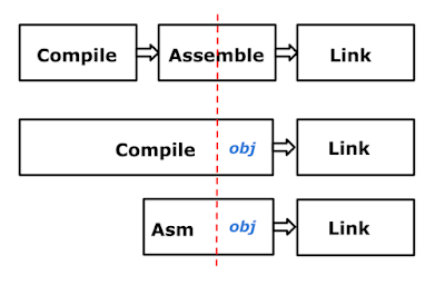 |
| The Go compiler architecture post Go 1.5 |
For Go version 1.5, Russ wrote a tool to translate the compiler semi-automatically from C to Go. By then the language was complete, and concerns about compiler-directed language design were irrelevant. There are talks online about this process that are worth a look. I gave one talk at GopherCon in 2016 about the assembler, which is something of a high point in my lifelong quest for portability.
 |
| The Design of the Go Assembler (GopherCon 2016) |
We did the right thing by starting in C, but eventually translating the compiler to Go has allowed us to bring to its development all the advantages that Go has, including testing, tooling, automatic rewriting, performance analysis, and so on. The current compiler is much cleaner than the original and generates much better code. But, of course, that is how bootstrapping works.
Remember, our goal was just not a language, but much more.
Our unusual approach was in no way an insult to LLVM or anyone in the language community. We just used the tool that best suited our task. And of course, today there is an LLVM-hosted compiler for Go, and many others, as there should be.
Project Management
We knew from the start that to succeed, Go had to be an open source project. But we also knew that it would be more productive to develop in private until we had the key ideas figured out and a working implementation. Those first two years were essential to clarifying, free of distraction, what we were trying to achieve.
The transition to open source was a huge change, and educational. The input from the community was overwhelming. Engaging with the community took a lot of time and effort, especially for Ian, who somehow found time to answer every question anyone asked. But it also brought so much more. I still marvel at how quickly the Windows port arrived, done entirely by the community under the guidance of Alex Brainman. That was amazing.
It took us a long time to understand the implications of the switch to an open source project, and how to manage it.
In particular, it's fair to say it took us too long to understand the best way to work with the community. A theme throughout this talk is poor communication on our part - even as we thought we were communicating well - and a lot of time was wasted due to misunderstandings and mismatched expectations. It could have been better done.
In time, though, we convinced the community, at least the part that stayed with us, that some of our ideas, although different from the usual open source way, were valuable. The most important were around our insistence on maintaining high code quality through mandatory code review and exhaustive attention to detail.
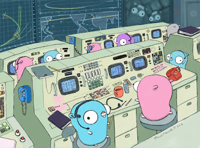 |
| Mission Control (drawing by Renee French) |
Some projects work differently, accepting code quickly and then cleaning up once it's been committed. The Go project works the other way around, trying to get the quality first. I believe that's the more efficient way, but it pushes more work back on the community and they need to understand the value or they will not feel as welcome as they should. There is still much to learn here, but I believe things are much better these days.
By the way, there's a historical detail that's not widely known. The project has had 4 different content management systems: SVN, Perforce, Mercurial and then Git. Russ did a Herculean job of keeping all the history alive, so even today the Git repo contains the earliest changes as they were made in SVN. We all believe it's valuable to keep the history around, and I thank him for doing the heavy lifting.
One other point. People often assume Google tells the Go team what to do. That's simply not true. Google is incredibly generous in its support for Go, but does not set the agenda. The community has far more input. Google has a huge internal Go code base that the team uses to test and verify releases, but this is done by importing from the public repo into Google, not the other way around. In short, the core Go team is paid by Google but they are independent.
Package Management
The process of developing package management for Go was not done well. The package design in the language itself was excellent, I believe, and consumed a large amount of time in the first year or so of our discussions. The SPLASH talk I mentioned earlier explains in detail why it works the way it does if you're interested.
A key point was the use of a plain string to specify the path in an import statement, giving a flexibility that we were correct in believing would be important. But the transition from having only a "standard library" to importing code from the web was bumpy.
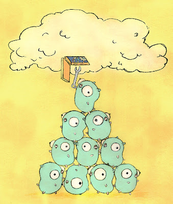 |
| Fixing the cloud (drawing by Renee French) |
There were two issues.
First, those of us on the core Go team early on were familiar with how Google worked, with its monorepo and everyone building at head. But we didn't have enough experience using a package manager with lots of versions of packages and the very difficult problems trying to resolve the dependency graph. To this day, few people really understand the technical complexities, but that is no excuse for our failure to grapple with those problems from the start. It's especially embarrassing because I had been the tech lead on a failed project to do something similar for Google's internal build, and I should have realized what we were up against.
My work on deps.dev was a something of a penance.
Second, the business of engaging the community to help solve the dependency management problem was well-intentioned, but when the final design came out, even with plenty of documentation and writing about the theory, many in the community felt slighted.
This failing was a lesson to the team in how engagement with the community should really work, and much has improved since as a result.
Things are settled now, though, and the design that emerged is technically excellent and appears to be working well for most users. It just took too long and the road was bumpy.
Documentation and Examples
Another thing we didn't get right up front was the documentation. We wrote a lot of it, and thought we did a good job, but it soon became clear that the community wanted a different level of documentation than we expected.
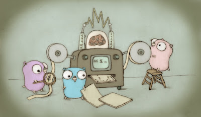 |
| Gophers fixing a Turing machine (drawing by Renee French) |
The key missing piece was examples of even the simplest functions. We thought that all you needed to do was say what something did; it took us too long to accept that showing how to use it was even more valuable.
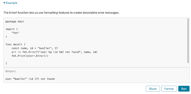 |
| Executable examples |
That lesson was learned, though. There are plenty of examples in the documentation now, mostly provided by open source contributors. And one thing we did very early was make them executable on the web. I gave a talk at Google I/O in 2012 that showed concurrency in action, and Andrew Gerrand wrote a lovely bit of web goo that made it possible to run the snippets right from the browser. I doubt that was the first time it had ever been done, but Go is a compiled language and many in the audience had never seen that trick before. The technology was then deployed to the blog and to the online package documentation.
Perhaps even more important was its deployment to the Go playground, a freely available open sandbox for people to try things out, and even develop code.
Conclusion
We have come a long way.
Looking back, it's clear many things were done right, and they all helped Go succeed. But much could have been done better, and it's important to own up to those and learn from them. There are lessons on both sides for anyone hosting a significant open source project.
I hope that my historical tour of the lessons and their causes will be helpful, and perhaps serve as a sort of apology/explanation for those who objected to what we were doing and how we were doing it.
 |
| GopherConAU 2023 mascot by Renee French |
But here we are, 14 years after the launch. And it's fair to say that overall it's a pretty good place.
Largely because of the decisions made through the design and development of Go as a way to write software - not just as a programming language - we have arrived somewhere novel.
We got here in part because of:
- a strong standard library that implements most of the basics needed for server code
- concurrency as a first-class component of the language
- an approach based on composition rather than inheritance
- a packaging model that clarifies dependency management
- integrated fast build and testing tools
- rigorous consistent formatting
- a focus on readability over cleverness
- a compatibility guarantee
And, most of all, because of the support of an unbelievably helpful and diverse community of Gophers.
 |
| A diverse community (drawings by @tenntenn) |
Perhaps the most interesting consequence of these matters is that Go code looks and works the same regardless of who's writing it, is largely free of factions using different subsets of the language, and is guaranteed to continue to compile and run as time goes on. That may be a first for a major programming language.
We definitely got that right.
Thank you.


